|
|
| Line 1: |
Line 1: |
| | <Font size=4><div align=center> | | <Font size=4><div align=center> |
| − | I'm working on a Chapter Logo and would like some input.
| + | These were some of the "Concept" Chapter Logos I put together before deciding on #6 (MFI-RC-112051.jpg). |
| − | | + | |
| − | Which "Phantom Zone" Logo do you guys & gals like better?
| + | |
| | | | |
| | {| width=700 align=center | | {| width=700 align=center |
| Line 17: |
Line 15: |
| | 5th Option<br> | | 5th Option<br> |
| | (Faded Maquis & Dominion Logos) | | (Faded Maquis & Dominion Logos) |
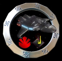
| − | |[[Image:MFI-RC-112051.jpg|200px]]<br> | + | |[[Image:MFI-RC-112051.jpg|200px]] |
| − | 6th Option<br> | + | <br>6th Option<br> |
| | + | This is the Logo I ended up using!!<br> |
| | |} | | |} |
| | | | |
| − | Click on the [+] tab above and add your comments!
| + | |
| | | | |
| | <font size=2> | | <font size=2> |
| | <div align=right> | | <div align=right> |
| − | Thanks for your input,<br>
| |
| | [[User:Gyazdir|Yazdir]] | | [[User:Gyazdir|Yazdir]] |
| | <div align=left> | | <div align=left> |
| Line 31: |
Line 29: |
| | | | |
| | ---- | | ---- |
| − |
| |
| − | == Suggestions for logo 2 ==
| |
| − |
| |
| − | The 2nd logo is almost there. Instead of the Kryptonian shield, try the Maquis claw in a similar small size. <br>
| |
| − |
| |
| − | -OR- Perhaps place a small Founders Logo and MFI claw in two locations within the center of the ring. <br>
| |
| − |
| |
| − | I just thought the 2nd is basically better but needs some <font color=red>color</font color>, even if only a small swatch... <br>
| |
| − |
| |
| − | -OR- Perhaps place one of the small logos in the center and the other replacing the runes at ONE location on the outer ring... <br>
| |
| − |
| |
| − | -OR- How 'bout... <trails off with a grin> <br>
| |
| − | <font color=blue>Steve</font color>
| |
| − | ----
| |
| − | ===More Ideas===
| |
| − | I like option 5. Did You consider making a text arc "Phantom Zone" across the top, inside the outer ring? <BR>
| |
| − | Also, You might want to try placing a Dominion logo in small size on top of the Maquis claw as a "Dominion Maquis" design. Similar to [[Image:Borg002.PNG]] <BR>
| |
| − | The small supeman shield/rune thingy doesn't seem to fit in that it doesn't seem to mean anything. <br>
| |
| − | The outer edge runes look super </pun> in that if you look you can see a "P" and "Z" in the stylized design. <br>
| |
| − | <font color=blue>Steve</font color>
| |
| − |
| |
| − | ----
| |
| − | == Updated Logos ==
| |
| − |
| |
| − | Good suggestions!!
| |
| − |
| |
| − | Thanks!
| |
| − |
| |
| − | ----
| |
| − |
| |
| − | == Phantom Zone logo ==
| |
| − |
| |
| − | I like #5 the best. It seems to be more balanced, in terms of graphics.
| |
| − |
| |
| − | Colonel Anne
| |
| − |
| |
| − | MFMC
| |
